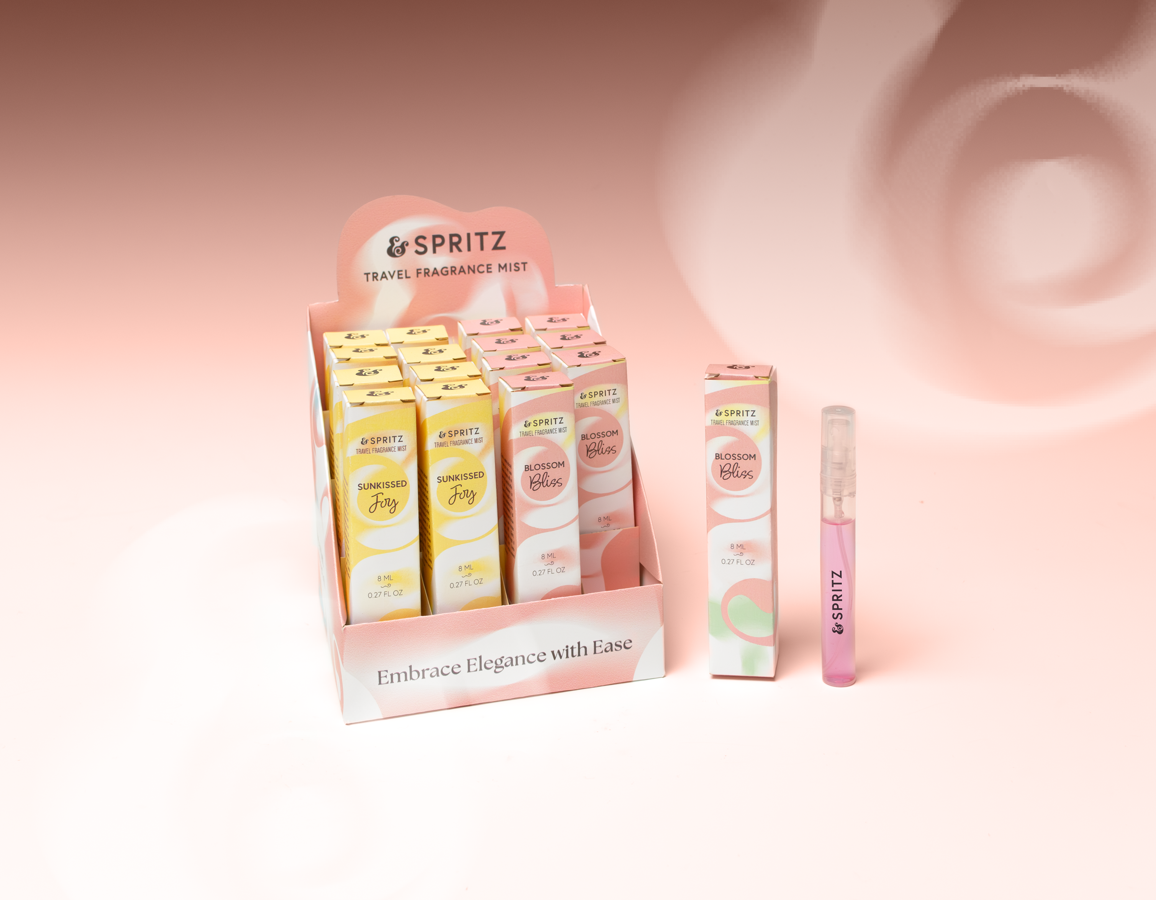
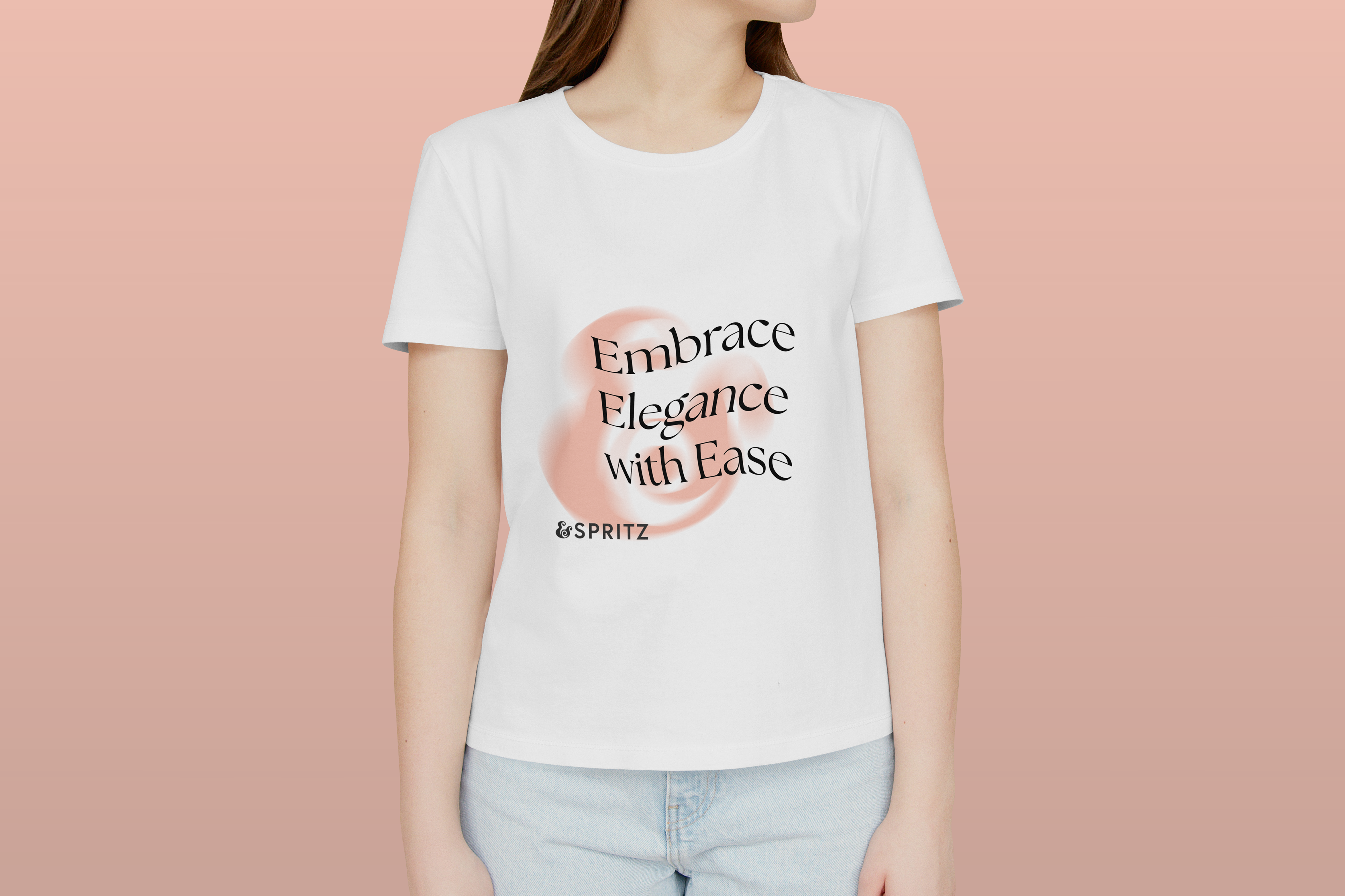
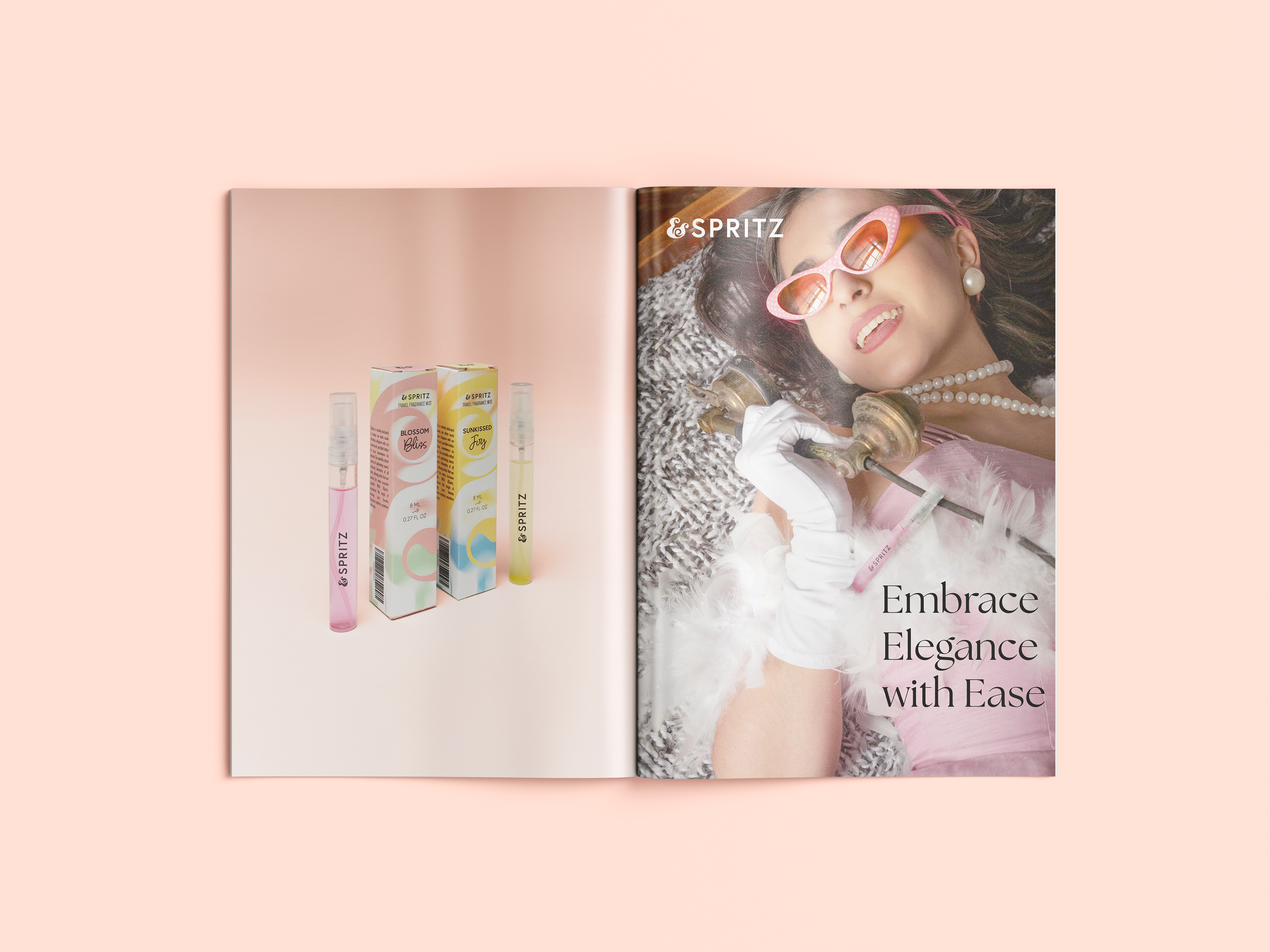
Spritz is entirely dedicated to portability and ease of use while allowing wearers to embrace their femininity confidently with travel-sized fragrance mists that can fit in every occasion through various fragrances that is offered.
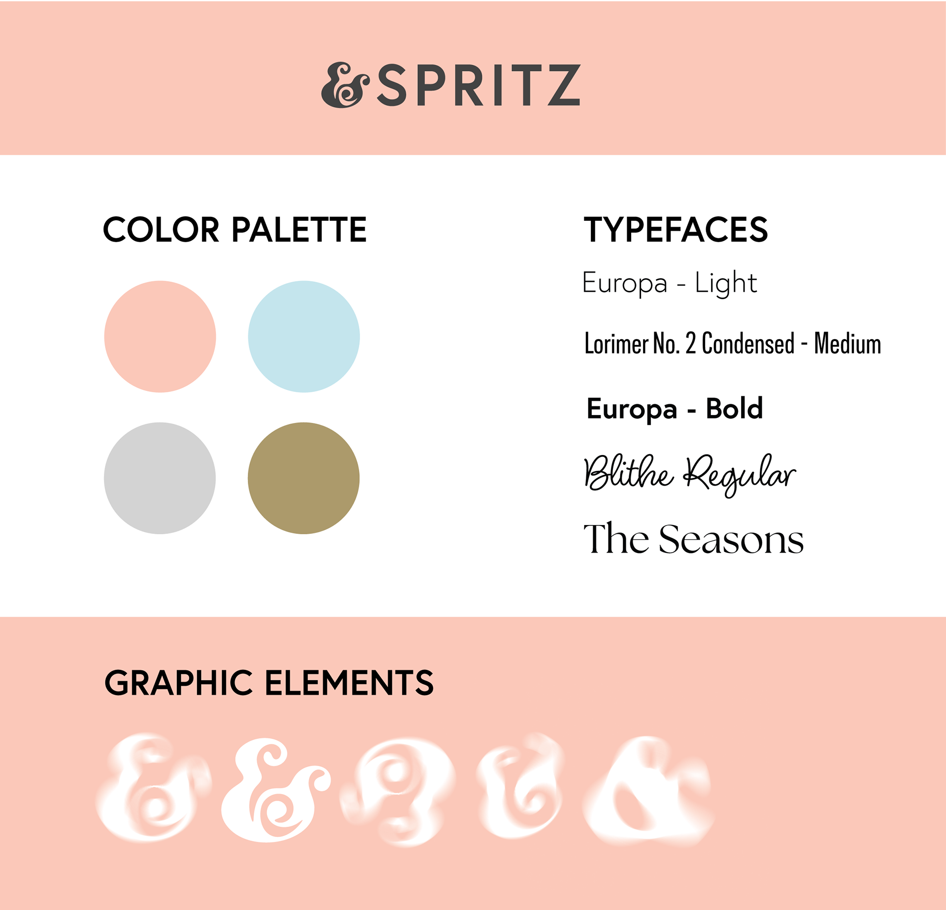
Style Guide of Spritz
The visual branding consists of blurring blends of the logo which is the ampersand symbol that signifies the partnership of femininity and elegance with convenience and ease of use while also serving as a way of visualizing the movement of sprays from different fragrances. Soft-pastel-like colors are utilized to convey the focus of the brand as being effortlessly feminine and sophisticated.

POP Display Dieline
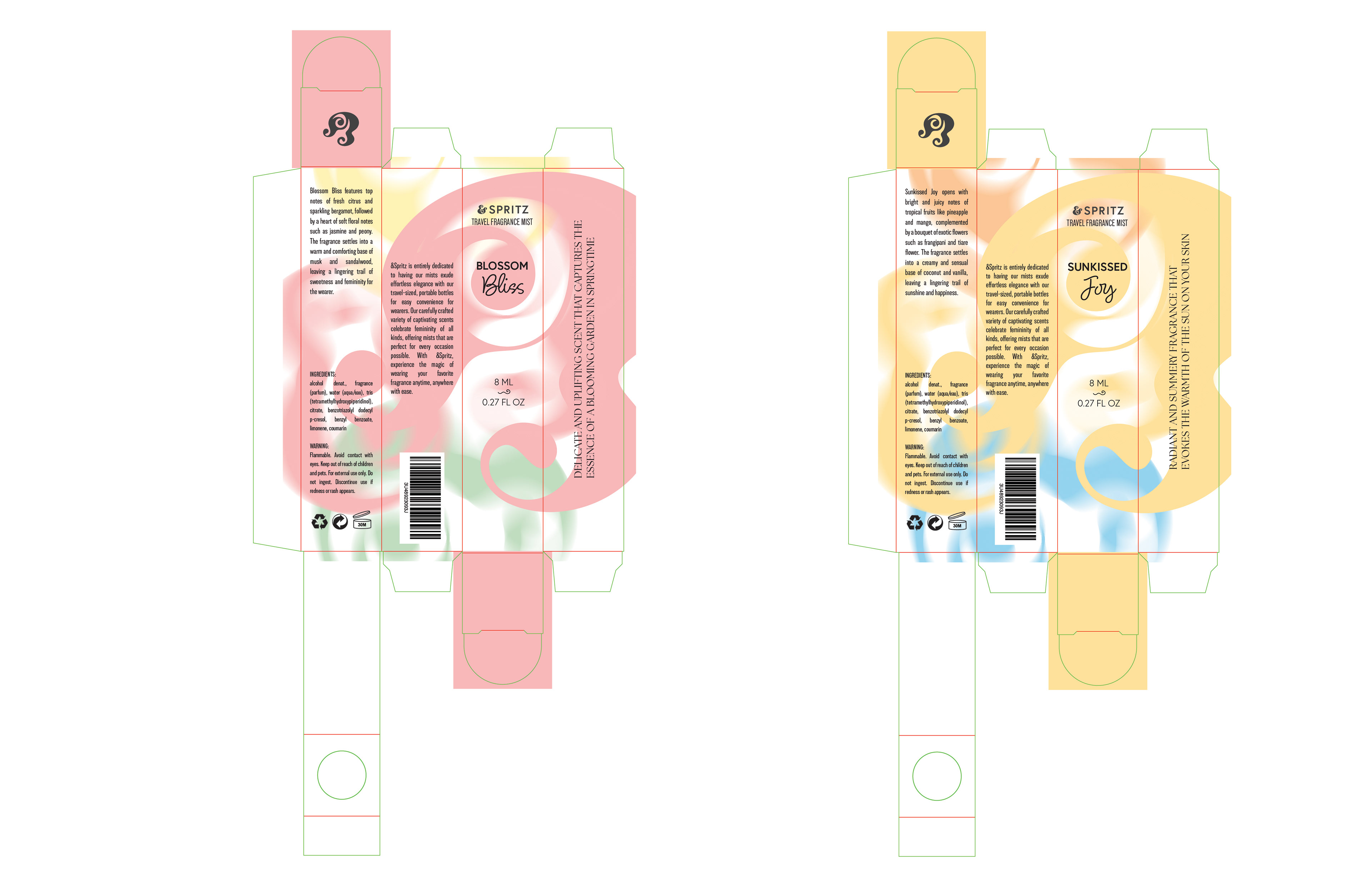
Tuckbox Dieline

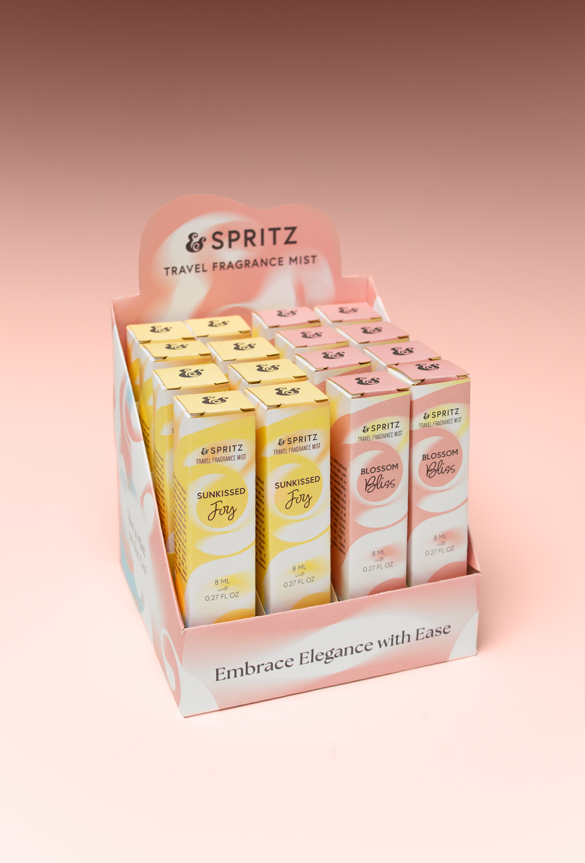
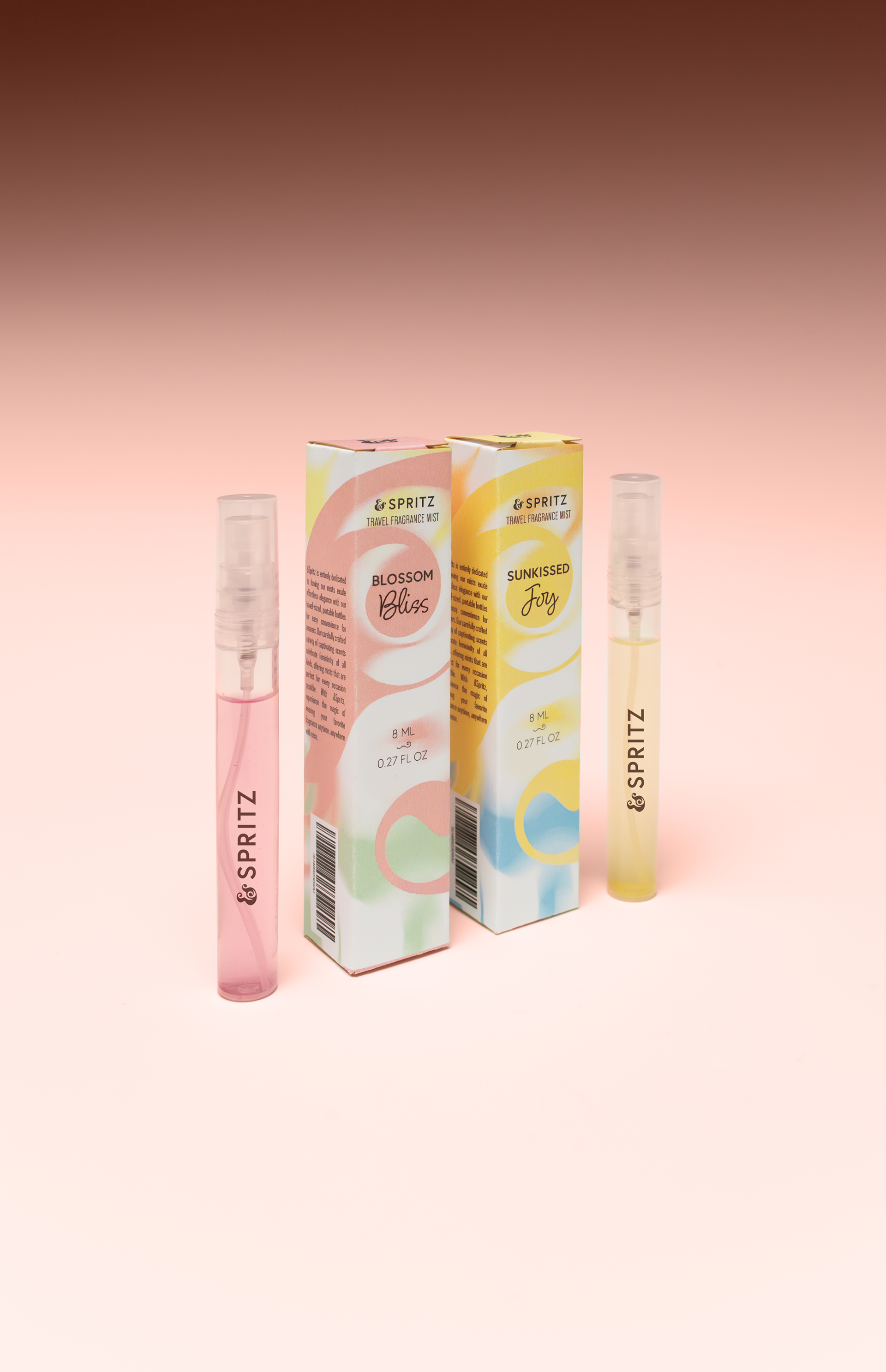
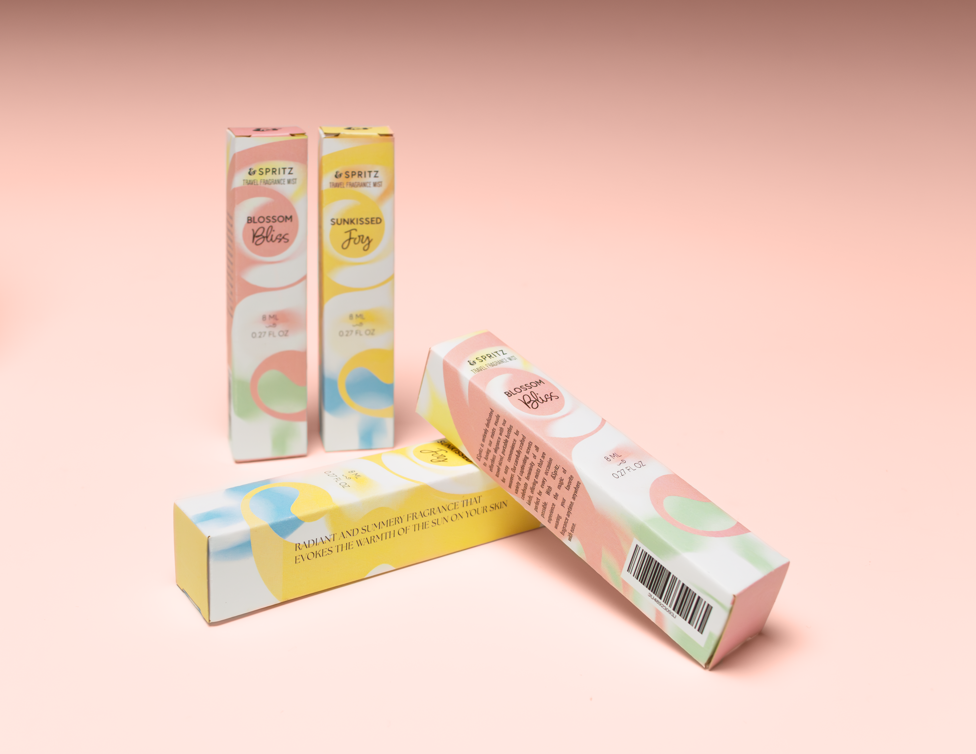
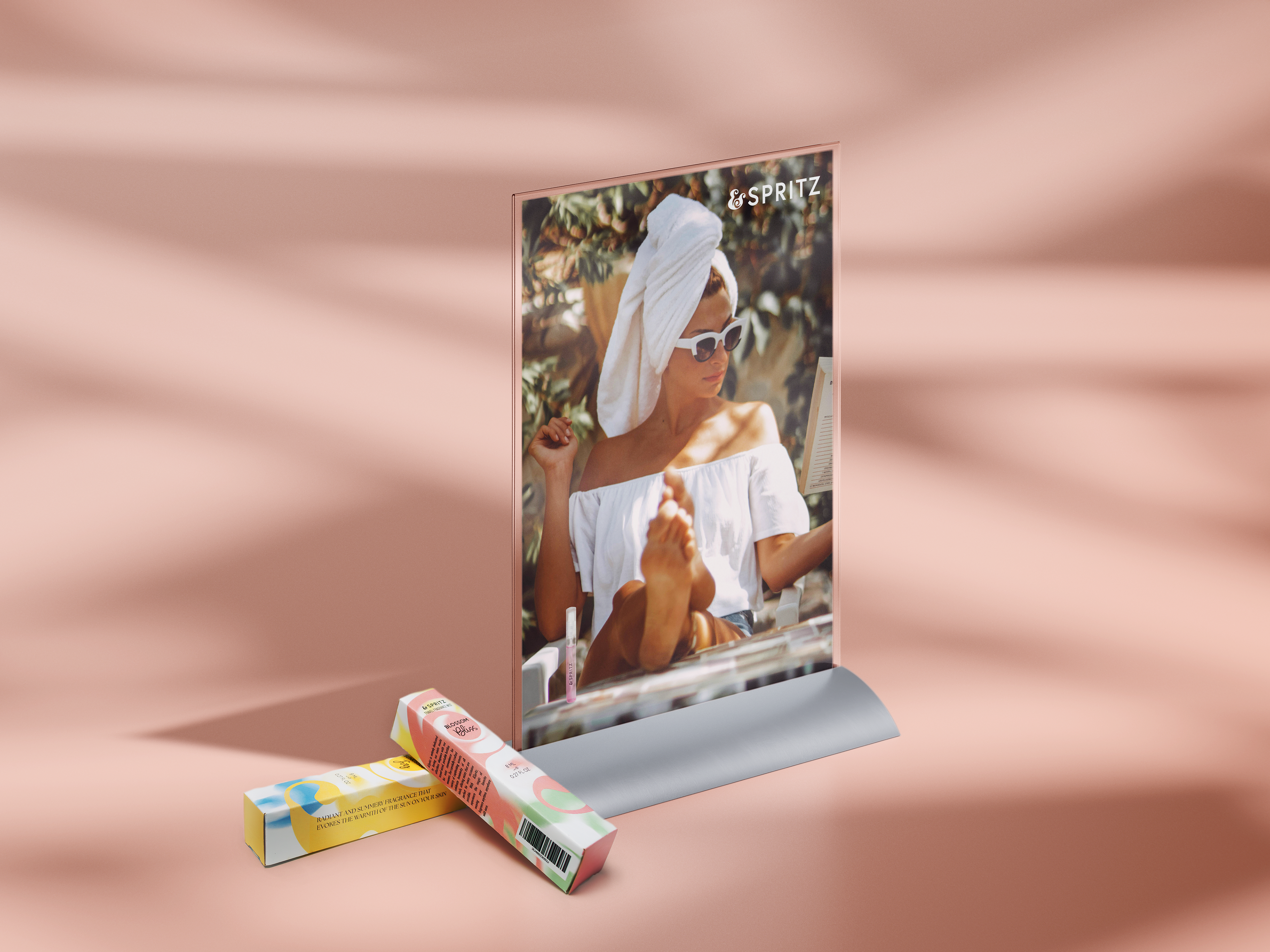
For the packaging, each tuck box was produced to fit one fragrance mist bottle with an additional flap inside to hold the bottle in place. Two designs were created for the tuck boxes: Blossom Bliss and Sunkissed Joy, to show a select range of fragrances that Spritz offers for their consumers. The POP display itself holds a maximum of 16 tuck boxes, allowing a range of different fragrances to be displayed for customers to easily pick out the perfect mist as their own.